Table of Contents
In this article, you’ll learn about What Is Python Matplotlib, What Is Matplotlib used for, Is Matplotlib Included in Python Types of Plots in Matplotlib and more.
What Is Python Matplotlib?
Matplotlib.pyplot is a plotting library used in the python programming language for 2D graphics. It can be used in python scripts, shells, servers for web applications, and other toolkits for graphical user interfaces.
What Is Matplotlib used for?
Matplotlib is Python Library used for plotting, this python library provides and objected-oriented APIs for integrating plots into applications.
Is Matplotlib Included in Python?
Matplotlib is not part of the default libraries that are installed by default. Some of them are independent downloads, others can be shipped but have additional dependencies with the source code of matplotlib.
Installation:
- Download Anaconda Navigator(anaconda3)
- Otherwise open CDM and type:
python -m pip install -U matplotlibPython Matplotlib : Types of Plots
- Bar Graph
- Histogram
- Scatter Plot
- Area Plot
- Pie Chart
1.Python Matplotlib: Bar Graph
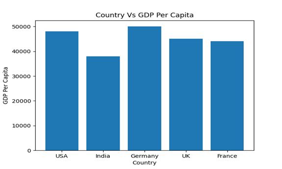
To compare data between various groups, a bar graph uses bars. When you want to calculate the changes over a period of time, it is well suited. Horizontally or vertically, it can be interpreted. The crucial thing to note too is that the higher the bar, the greater the value.
Now, using python matplotlib, let us implement it functionally.
import matplotlib.pyplot as plt

Country = ['USA','India','Germany','UK','France']
GDP_Per_Capita = [48000,38000,50000,45000,44000]

plt.bar(Country, GDP_Per_Capita)
plt.title('Country Vs GDP Per Capita')
plt.xlabel('Country')
plt.ylabel('GDP Per Capita')
plt.show()
Output:
2. Python Matplotlib: Histogram
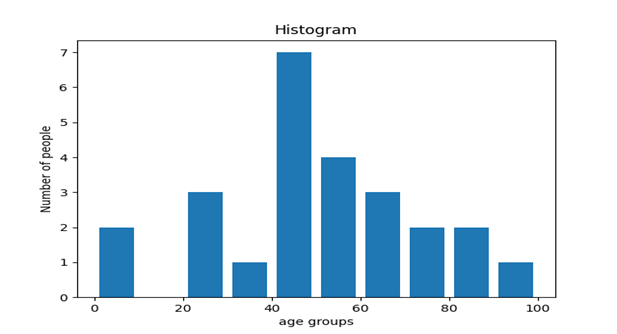
A histogram is used to represent a distribution, while a bar chart is used to compare various entities. When you have arrays or a long list, histograms are useful. Now, using python matplotlib, let us implement it functionally.
import matplotlib.pyplot as plt
population_age= [22,55,62,45,21,22,34,42,42,4,2,102,95,85,55,110,
                                 120,70,65,55,111,115,80,75,65,54,44,43,42,48]
bins=[0,10,20,30,40,50,60,70,80,90,100]
plt.hist(population_age,bins,histtype='bar',rwidth=0.8)
plt.xlabel('age groups')
plt.ylabel('Number of people')
plt.title('Histogram')
plt.show()
plt.show()
Output:
3. Python Matplotlib: Scatter plot
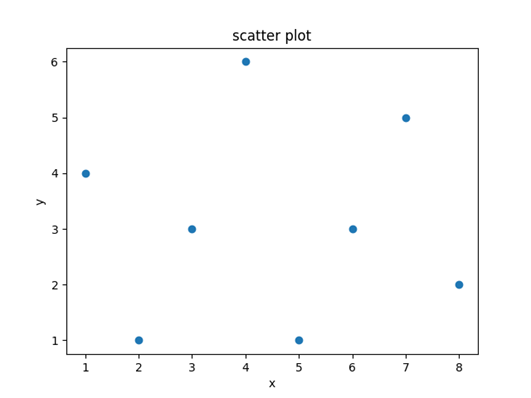
In order to compare variables, we typically need scatter plots, for instance, how much one variable is influenced by another variable to construct a relationship out of it. The data is shown as a set of points, each of which has the value of a single variable that determines the position on the horizontal axis, and the position on the vertical axis is determined by the value of another variable.
import matplotlib.pyplot as plt

x = [1,2,3,4,5,6,7,8]
y = [4,1,3,6,1,3,5,2]

plt.scatter(x,y)

plt.title('scatter plot')
plt.xlabel('x')
plt.ylabel('y')


plt.show()
Output:
4. Python Matplotlib: Area plot
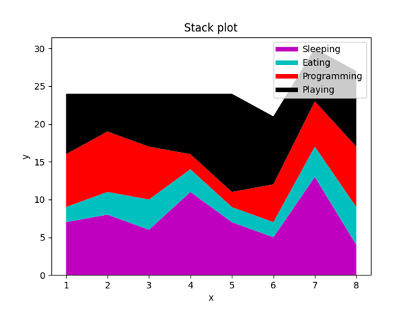
Such plots are very similar to the line plot. They are also called as stack plots. For two or more similar classes that make up one whole category, these plots can be used to track changes over time.
import matplotlib.pyplot as plt

days = [1,2,3,4,5,6,7,8]
sleeping= [7,8,6,11,7,5,13,4]
eating=[2,3,4,3,2,2,4,5]
working=[7,8,7,2,2,5,6,8]
playing=[8,5,7,8,13,9,7,10]

plt.plot([],[],color='m', label='Sleeping',linewidth=5)
plt.plot([],[],color='c', label='Eating',linewidth=5)
plt.plot([],[],color='r', label='Programming',linewidth=5)
plt.plot([],[],color='k', label='Playing',linewidth=5)

plt.stackplot(days,sleeping,eating,working,playing,colors=['m','c','r','k'])

plt.title('Stack plot')
plt.xlabel('x')
plt.ylabel('y')
plt.legend()
plt.show()
Output:
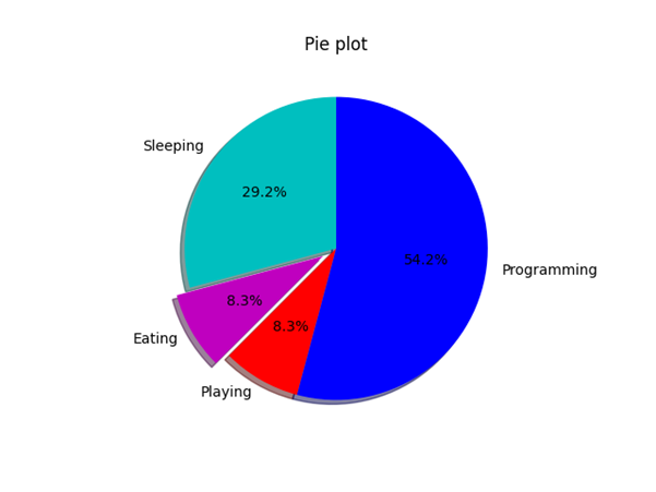
5. Python Matplotlib: Pie Chart
A pie chart refers to a circular graph that is divided into parts, i.e. pie slices. Basically, it is used to display the percentage or relative data where a segment is represented by each slice of pie.
import matplotlib.pyplot as plt

days = [1,2,3,4,5]
sleeping= [7,8,6,11,7]
eating=[2,3,4,3,2]
working=[7,8,7,2,2]
playing=[8,5,7,8,13]
slices=[7,2,2,13]
activities=['Sleeping', 'Eating' , 'Playing',  'Programming']
cols=['c', 'm', 'r', 'b']


plt.pie(slices,labels=activities,colors=cols,startangle=90,
              shadow=True,explode=(0,0.1,0,0),autopct='%1.1f%%')

plt.title('Pie plot')
plt.show()
Output:
Would love to know your feedback, Thank You for reading.
1 comment
Great work Prateek!
Comments are closed.