Table of Contents
In this article, you’ll learn about Line Plot in Matplotlib, Multiple subplots in one figure in Matplotlib, Contouring and pseudocolor in Matplotlib, Images in Matplotlib.
Line Plot in Matplotlib
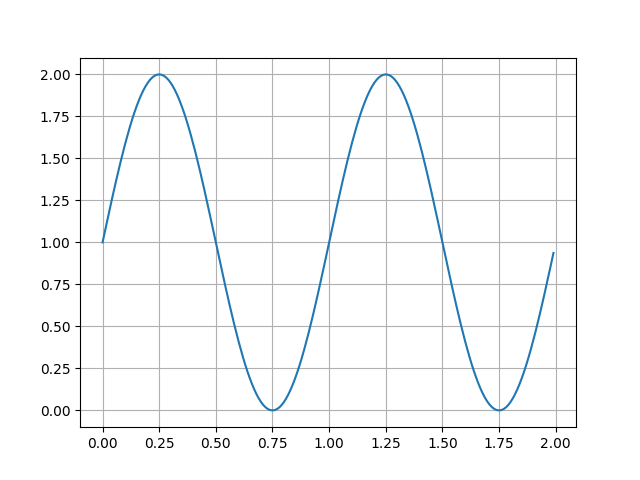
Here’s how to create a Line plot with text labels using plot().
import matplotlib
import matplotlib.pyplot as plt
import numpy as np

# Data for plotting
t = np.arange(0.0, 2.0, 0.01)
s = 1 + np.sin(2*np.pi*t)

fig, ax = plt.subplots()
ax.plot(t, s)

ax. set (xlabel='time (s)',ylabel=' voltage(mV)'
              title='About as simple as it gets, folks' )
ax.grid()

fig. savefig("test.png")
plt. show( )
Output:
Multiple subplots in one figure in Matplotlib
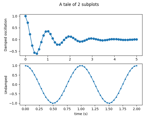
Multiple axes (i.e. subplots) are created with the subplot() function:
import numpy as np
import matplotlib.pyplot as plt
x1 = np.linspace(0.0, 5.0)
x2 = np.linspace(0.0, 2.0)

y1 = np.cos(2 * np.pi * x1) * np.exp(-x1)
y2 = np.cos(2 * np.pi * x2)

fig, (ax1, ax2) = plt.subplots(2, 1)
fig.suptitle('A tale of 2 subplots')

ax1.plot(x1, y1, 'o-')
ax1.set_ylabel('Damped oscillation')

ax2.plot(x2, y2, '.-')
ax2.set_xlabel('time (s)')
ax2.set_ylabel('Undamped')

plt.show()
Output:
Images in Matplotlib
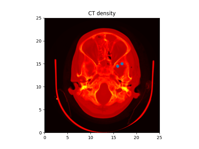
Using the imshow() function, Matplotlib can display images (assuming equally spaced horizontal dimensions).
import numpy as np
import matplotlib.cm as cm
import matplotlib.pyplot as plt
import matplotlib.cbook as cbook
from matplotlib.path import Path
from matplotlib.patches import PathPatch
# A sample image
w, h= 512, 512

with cbook.get_sample_data('ct.raw.gz') as datafile:
         s=datafile.read()

A = np.frombuffer(s, np.uint16).astype(float).reshape((w, h))
A /= A.max()

fig, ax = plt.subplots()
extent = (0, 25, 0, 25)
im = ax.imshow(A, cmap=plt.cm.hot, origin='upper', extent=extent)

markers=[(15.9,14.5),(16.8,15)]
x, y = zip(*markers)
ax.plot(x, y,'o')

ax.set_title('CT density')

plt.show()
Output:
Contouring and pseudocolor in Matplotlib
A colored representation of a two-dimensional array can be done by the pcolormesh() function. Even if there is the uneven spacing between the horizontal dimensions. The contour() is another way for the same data to be represented:
import matplotlib
import matplotlib.pyplot as plt
from matplotlib.colors import BoundaryNorm
from matplotlib.ticker import MaxNLocator
import numpy as np
np.random.seed(19680801)
Z = np.random.rand(6, 10)
x = np.arange(-0.5, 10, 1)   # ten = 11
y = np.arange(4.5, 11, 1)  # ten = 7

fig, ax = plt.subplots()
ax.pcolormesh(x, y, Z)
plt.show()
Output:
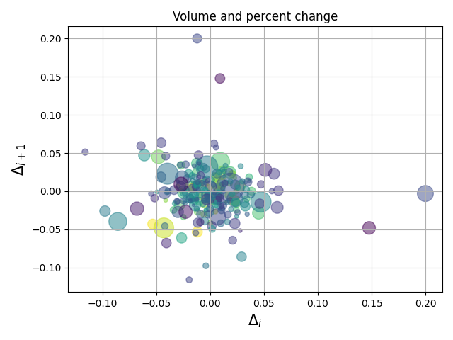
Hope you enjoyed this article on Plots, Images, Contour and Pseudocolor in Matplotlib, Happy Programming 🙂
