Table of Contents
In this article, you’ll learn about Ellipse, Pie Charts, Tables and Scatter Plot in Matplotlib using Python with examples.
Ellipses in Matplotlib
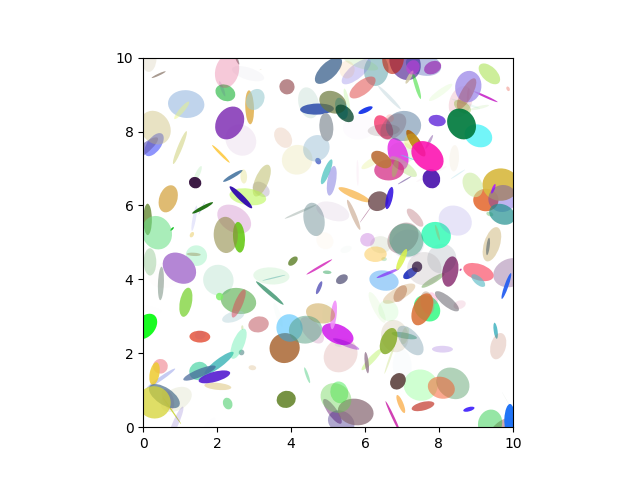
Matplotlib provides tools to plot ellipses, which are oval shapes defined by their center, major and minor axes, and rotation angle. This is useful in various applications, such as image processing and statistical analysis.
In support of the mission Phoenix to Mars (which used Motplotlib to display ground tracking of spacecraft). Michael Droettboom built on work by Charlie Mood to provide elliptical arcs with an extremely precise 8-spline approximation (see Arc).which are insensitive to zoom level.
import matplotlib.pyplot as plt
import numpy as np
from matplotlib.patches import Ellipse

# Fixing random stole for reproducibility
np.random.seed(19680801)

NUM = 250

ells =[Ellipse(xy=np.random.rand(2) * 10,
          width=np.random.rand(), height=np.random.rand(),
          angle=np.random.rand() * 360)
           for i in range(NUM)]
fig, ax = plt.subplots(subplot_kw={'aspect': 'equal'})
for e in ells:
       ax.add_artist(e)
       e.set_clip_box(ax.bbox)
       e.set_alpha(np.random.rand())
       e.set_facecolor(np.random.rand(3))

ax.set_xlim(0,10)
ax.set_ylim(0,10)
plt.show()
Output:
Pie Charts in Matplotlib
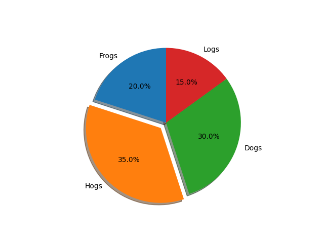
Matplotlib allows for the creation of pie charts, a circular statistical graphic which is divided into slices to illustrate numerical proportions. Each slice represents a category, and its size is proportional to the frequency or percentage of the data it represents.
You can generate pie charts using the pie() function. Auto-Labeling the percentage of area includes optional features. Exploding one or more wedges and a shadow effect from the middle of the pie. Take a close look at the code attached. Which in just a few lines of code generates this figure.
import matplotlib.pyplot as plt
# Pie chart,where the slices are ordered and counter-ctockwise plotted:
labels = 'Frogs', 'Hogs', 'Dogs', 'Logs'
sizes = [20, 35, 30 ,15]
explode = (0, 0.1, 0, 0) # The 2nd slice (i.e. 'Hogs') just "explode"

fig1, ax1= plt.subplots()
ax1.pie(sizes, explode=explode, labels=labels, autopct='%1.1f%%', shadow=True, startangle=90)
axl.axis('equal')  # The equal aspect ratio guarantees the drawing of the pie as a circle.
plt.show()
Output:
Tables in Matplotlib
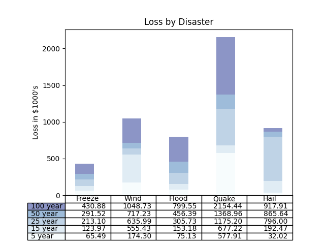
While primarily a plotting library, Matplotlib can also generate basic tables to display data in a tabular format. This functionality is often used for simple data presentations.
import numpy as np
import matplotlib.pyplot as plt


data = [[ 65486, 174296,  75131, 577908,  32015],[ 58480, 381139,  78045,  99308, 160454],
[ 89135,  80552, 152558, 497981, 603535],[ 78415,  81238, 150656, 193763,  69638],
[139361, 331509, 343164, 785480,  52269]]

columns = ('Freeze', 'Wind', 'Flood', 'Quake', 'Hail')
rows = ['%d year' % x for x in (100, 50, 25, 15, 5)]

values = np.arange(0, 2500, 500)
value_increment = 1000

# Get some pastel shades for the colors
colors = plt.cm.BuPu(np.linspace(0, 0.5, len(rows)))
n_rows = len(data)

index = np.arange(len(columns)) + 0.3
bar_width = 0.4

# For the stacked bar chart, initialise the vertical-offset.
y_offset = np.zeros(len(columns))

# Plot bars and build table text labels
cell_text = []
for row in range(n_rows):
    plt.bar(index, data[row], bar_width, bottom=y_offset, color=colors[row])
    y_offset = y_offset + data[row]
    cell_text.append(['%1.2f' % (x / 1000.0) for x in y_offset])
# To show the last value at the top, reverse the colours and text labels.
colors = colors[::-1]
cell_text.reverse()

# At the bottom of the axis, add a table
the_table = plt.table(cellText=cell_text,
                      rowLabels=rows,
                      rowColours=colors,
                      colLabels=columns,
                      loc='bottom')

# To make space for the table, adjust the layout:
plt.subplots_adjust(left=0.2, bottom=0.2)

plt.ylabel("Loss in ${0}'s".format(value_increment))
plt.yticks(values * value_increment, ['%d' % val for val in values])
plt.xticks([])
plt.title('Loss by Disaster')

plt.show()
Output:
Scatter Plot in Matplotlib
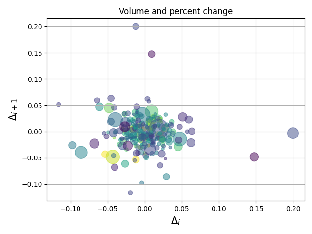
Matplotlib excels at creating scatter plots, which display values for typically two variables for a set of data. Each data point is represented by a dot on a two-dimensional plot. Scatter plots are useful for identifying patterns, correlations, and outliers in data.
The scatter() function renders a scatter plot with (optional) size and color arguments. This example charts shifts in Google’s stock price with marker sizes representing the trading volume and colors differ, with time. Here, the alpha attribute is used to render semitransparent circle markers.
import numpy as np
import matplotlib.pyplot as plt
import matplotlib.cbook as cbook

# Load an array of numpy records from Yahoo csv data with date fields, open, close,
# volume, adj_close from the mpl-data/example directory. The record array
# In the date column, store the date as np.datetime64 with a day unit ('D').
price_data = (cbook.get_sample_data('goog.npz', np_load=True)['price_data']
              .view(np.recarray))
price_data = price_data[-250:]  # Get the most recent 250 days of trading
delta1 = np.diff(price_data.adj_close) / price_data.adj_close[:-1]

# Marker size in units of points^2
volume = (15 * price_data.volume[:-2] / price_data.volume[0])**2
close = 0.0031 * price_data.close[:-2] / 0.0031 * price_data.open[:-2]

fig, ax = plt.subplots()
ax.scatter(delta1[:-1], delta1[1:], c=close, s=volume, alpha=0.5)

ax.set_xlabel(r'$\Delta_i$', fontsize=15)
ax.set_ylabel(r'$\Delta_{i+1}$', fontsize=15)
ax.set_title('Volume and percent change')

ax.grid(True)
fig.tight_layout()

plt.show()
Output:
Hope you enjoyed this article on Ellipse, Pie Charts, Tables and Scatter Plot in Matplotlib, Happy Programming 🙂
