Table of Contents
In this article, you’ll learn about GUI Widgets in Matplotlib, Date Tick labels in Matplotlib, Polar Plots in Matplotlib, and XKCD-style sketch plots in Matplotlib using python.
GUI Widgets in Matplotlib
Matplotlib has simple GUI widgets that allow you to write cross-GUI figures and widgets, irrespective of the graphical user interface you are using. See matplotlib.widget and the widget examples.
import numpy as np
import matplotlib.pyplot as plt
from matplotlib.widgets import Slider, Button, RadioButtons

fig, ax = plt.subplots()
plt.subplots_adjust(left=0.25, bottom=0.25)
t = np.arange(0.0, 1.0, 0.001)
a0 = 5
f0 = 3
delta_f = 5.0
s = a0 * np.sin(2 * np.pi * f0 * t)
l, = plt.plot(t, s, lw=2)
ax.margins(x=0)

axcolor = 'lightgoldenrodyellow'
axfreq = plt.axes([0.25, 0.1, 0.65, 0.03], facecolor=axcolor)
axamp = plt.axes([0.25, 0.15, 0.65, 0.03], facecolor=axcolor)

sfreq = Slider(axfreq, 'Freq', 0.1, 30.0, valinit=f0, valstep=delta_f)
samp = Slider(axamp, 'Amp', 0.1, 10.0, valinit=a0)


def update(val):
    amp = samp.val
    freq = sfreq.val
    l.set_ydata(amp*np.sin(2*np.pi*freq*t))
    fig.canvas.draw_idle()


sfreq.on_changed(update)
samp.on_changed(update)

resetax = plt.axes([0.8, 0.025, 0.1, 0.04])
button = Button(resetax, 'Reset', color=axcolor, hovercolor='0.975')


def reset(event):
    sfreq.reset()
    samp.reset()
button.on_clicked(reset)

rax = plt.axes([0.025, 0.5, 0.15, 0.15], facecolor=axcolor)
radio = RadioButtons(rax, ('red', 'blue', 'green'), active=0)


def colorfunc(label):
    l.set_color(label)
    fig.canvas.draw_idle()
radio.on_clicked(colorfunc)

# Initialize plot with correct initial active value
colorfunc(radio.value_selected)

plt.show()
Output:

Date Tick labels in Matplotlib
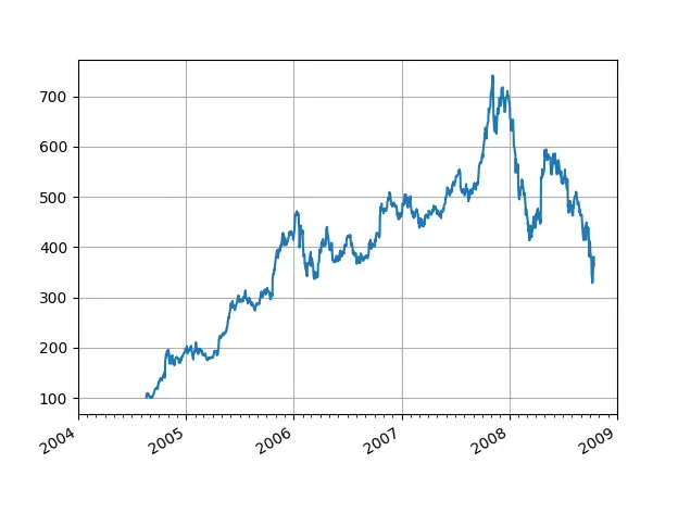
Using date tick locators and Formatters to demonstrate how to create date plots in Matplotlib. For further details on managing major and minor ticks, see Major and Minor Ticks.
By translating date instances into days from 0001-01-01 00:00:00 UTC plus one day(for historical reasons), all Matplotlib date plotting is completed . Behind the scenes, the conversion, tick location and formatting is performed so that it is most clear to you. The matplotlib.dates module provides the date2num and num2date converter functions that translate datetime.datetime and numpy.datetime64 objects to and from an internal representation of Matplotlib.
import numpy as np
import matplotlib.pyplot as plt
import matplotlib.dates as mdates
import matplotlib.cbook as cbook

years = mdates.YearLocator()   # every year
months = mdates.MonthLocator()  # every month
years_fmt = mdates.DateFormatter('%Y')

# Load a numpy structured array of  fields date from Yahoo csv info, open,
# close, volume, adj_close from the mpl-data/example directory.  This array
# The date is stored in the 'date' as np.datetime64 with a day unit ('D')
# column.
data = cbook.get_sample_data('goog.npz', np_load=True)['price_data']

fig, ax = plt.subplots()
ax.plot('date', 'adj_close', data=data)

# format the ticks
ax.xaxis.set_major_locator(years)
ax.xaxis.set_major_formatter(years_fmt)
ax.xaxis.set_minor_locator(months)

# round to nearest years.
datemin = np.datetime64(data['date'][0], 'Y')
datemax = np.datetime64(data['date'][-1], 'Y') + np.timedelta64(1, 'Y')
ax.set_xlim(datemin, datemax)

# format the coords message box
ax.format_xdata = mdates.DateFormatter('%Y-%m-%d')
ax.format_ydata = lambda x: '$%1.2f' % x  # format price.
ax.grid(True)

# The x labels are rotated and positioned correctly, and the bottom of the label shifts
# axes up to make room for them
fig.autofmt_xdate()

plt.show()
p
Output:

Polar Plots in Matplotlib
The polar() function generates polar plots.
import numpy as np
import matplotlib.pyplot as plt


r = np.arange(0, 2, 0.01)
theta = 2 * np.pi * r

fig, ax = plt.subplots(subplot_kw={'projection': 'polar'})
ax.plot(theta, r)
ax.set_rmax(2)
ax.set_rticks([0.5, 1, 1.5, 2])  # Less radial ticks
ax.set_rlabel_position(-22.5)  # Moving radial labels away from the line plotted
ax.grid(True)

ax.set_title("A line plot on a polar axis", va='bottom')
plt.show()
Output:

XKCD-style sketch plots in Matplotlib
Just for fun, in xkcd format, Matplotlib supports plotting.
import matplotlib.pyplot as plt
import numpy as np
with plt.xkcd():

    fig = plt.figure()
    ax = fig.add_axes((0.1, 0.2, 0.8, 0.7))
    ax.spines['right'].set_color('none')
    ax.spines['top'].set_color('none')
    ax.set_xticks([])
    ax.set_yticks([])
    ax.set_ylim([-30, 10])

    data = np.ones(100)
    data[70:] -= np.arange(30)

    ax.annotate(
'THE DAY I REALIZED\nI COULD COOK BACON\nWHENEVER I WANTED',
        xy=(70, 1), arrowprops=dict(arrowstyle='->'), xytext=(15, -10))

    ax.plot(data)

    ax.set_xlabel('time')
    ax.set_ylabel('my overall health')
    fig.text(
0.5, 0.05,
'"Stove Ownership" from xkcd by Randall Munroe',
ha='center')
plt.show()
Output:


1 comment
I feel that is among the most vtal info for me. And i’m satisfied studying your article.
The articles is in reality nice : D. Good activity, cheers
Comments are closed.