Table of Contents
In this article, you’ll learn about pyplot in Matplotlib, Formatting the style of your plot in Matplotlib, Plotting with categorical variables in Matplotlib, and Working with Text in Matplotlib.
Introduction to Pylot
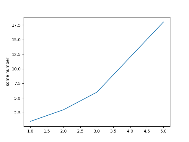
Matplotlib.pylot is a set of functions which, make matplotlib work like MATLAB. Each pyplot function modifies the figure somewhat for example, creates a figure, generates a plotting area in a figure, plots certain lines in the plotting area, decorates the plot with labels, etc.
Various states are maintained through function calls in matplotlib.pyplot. To keep track of things such as the current figure and plotting area and the plotting functions are aimed at the current axes (please note that “axes” here and in most places in the documentation refers to the axes part of a figure and not the strict mathematical term for more than one axis).
import matplotlib.pyplot as plt
plt.plot([1,2,3,4,5],[1,3,6,12,18])
plt.ylabel('some number')
plt.show()
Output:
Formatting the style of your plot in Matplotlib
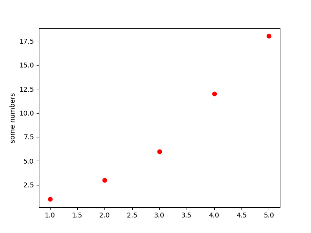
There is an optional third argument for every x,y pair of arguments, which is the format string that shows the plot colour and line type. The letters and symbols of the format string are from MATLAB, and you concatenate a colour string with a line type string. The default format string is ‘b-‘. which is a solid blue line For example, to map the above with red circles, you would issue.
import matplotlib.pyplot as plt
plt.plot([1,2,3,4,5],[1,3,6,12,18],'ro')
plt.ylabel('some numbers')
plt.show()
Output:
Plotting with Keywords Strings in Matplotlib
There are several cases where you have data in a format that allows you with strings to access specific variables. For instance,. With pandas.DataFrame or numpy.recarray.
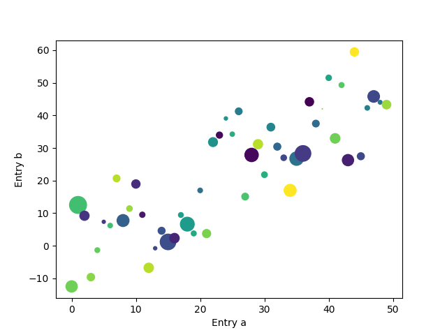
Matplotlib allows you to use the data keyword argument to have such an entity. You can generate plots with the strings corresponding to these variables, if given.
import matplotlib.pyplot as plt
import numpy as np

data = {'a': np.arange(50),
              'c': np.random.randint(0, 50, 50),
              'd': np.random.randn(50)}
data['b' ]=data['a'] + 10 * np.random.randn(50)
data['d'] = np.abs(data['d']) * 100

plt.scatter('a' ,'b', c='c', s='d', data=data)
plt.xlabel('Entry a')
plt.ylabel( 'Entry b')
plt.show()
Output:
Plotting with categorical variables in Matplotlib
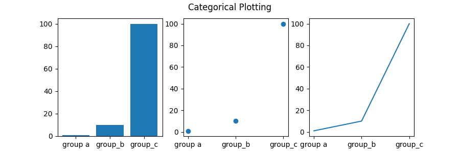
It is also possible to use categorical variables to construct the plot. You can transfer categorical variables directly to several plotting functions via Matplotlib. For example:
import matplotlib. pyplot as plt
import numpy as np

names = [ 'group a', 'group_b' ,  'group_c'  ]
values = [1, 10, 100]

plt.figure(figsize=(9, 3))

plt.subplot(131)
plt.bar(names, values)
plt.subplot(132)
plt.scatter (names, values)
plt.subplot(133)
plt.plot(names, values)
plt.suptitle( 'Categorical Plotting')
plt.show()
Output:
Working with Text in Matplotlib
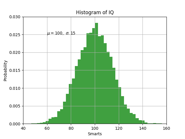
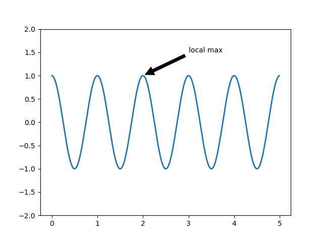
You can use text to add text at an arbitrary location, and you can use xlabel, ylabel, and title to add text at the specified locations.
Example 1:
import matplotlib.pyplot as plt
import numpy as np
mu, sigma=100,15
x= mu + sigma *np.random.randn(10000)


n, bins, patches=plt.hist(x, 50, density=1, facecolor='g',alpha=0.75)

plt.xlabel('Smarts')
plt.ylabel('Probability')
plt.title('Histogram of IQ')
plt.text(60, .025, r'$\mu=100, \ \sigma.15$')
plt.axis([40, 160, 0, 0.03])
plt.grid(True)
plt.show()
Output:
Example 2:
import matplotlib.pyplot as plt
import numpy as np
ax = plt.subplot(111)

t=np.arange(0.0, 5.0, 0.01)
s=np.cos(2*np.pi*t)
line = plt.plot(t, s, lw=2)

plt.annotate('local max', xy=(2, 1), xytext=(3, 1.5), arrowprops=dict(facecolor='black', shrink=0.05))
plt.ylim(-2, 2)
plt.show()
Output:
Would love to know your feedback, Thank You for reading.