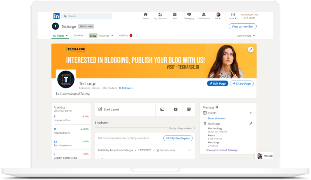
Today, LinkedIn done its major user interface change after five years for its web and mobile clients. The company says that this redesign comes from the previous refresh, and aims to make the experience “easy, inclusive, enjoyable”. As part of the refresh, the firm has enhanced its UI design that improved navigation, new features for search, and focuses on accessibility as well.

The changes in the UI part are more rounded corners, larger icons, and warmer colors. The larger touch targets and overall UI changes help improve interaction capabilities for those that use accessibility features and for the differently-abled. A new, streamlined search experience also added which makes it much easier to surface the people, events, groups, and content you want, while helping you reach beyond your immediate network.
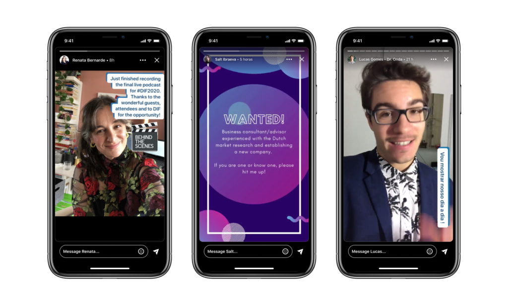
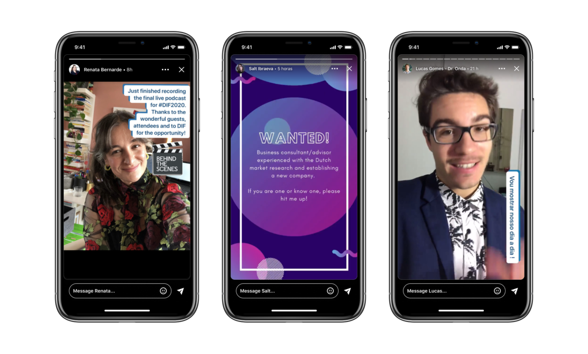
Like Instagram, Facebook & Twitter, LinkedIn also introduced the Stories platform. The firm believes this feature fits in the professional context. The Microsoft-owned company also plans to add a dark mode to the app and web client soon.

Another significant area of improvement is the messages section. The company is working to add support for users to directly connect to video meetings on Teams, Zoom, and other third-party services right from direct messages. Other features include the ability to edit, react to, and bulk manage messages.
Hope you like this article , Read other articles.

1 comment
Great beat ! I would like to apprentice while you amend your web site,
how could i subscribe for a blog website? The account helped me a
acceptable deal. I had been tiny bit acquainted of this your broadcast
provided bright clear concept
Comments are closed.